This checklist is designed to help you “thin-slice” your own Vehicle Wrap Branding. It moves past the subjective question of “Do I like this design?” and focuses on the objective question: “Does this design work?”
Use these five pillars to evaluate your current fleet or your next design proof. See our Gallery for how these work
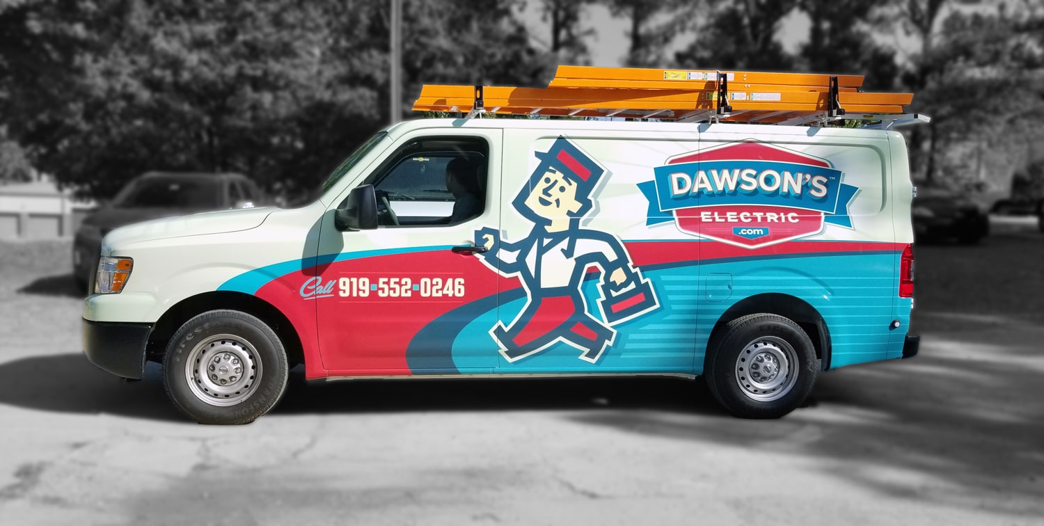
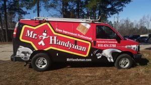
1. The 3-Second Recognition Test
In the sociology of the street, you don’t have an audience; you have passersby. If you cannot answer these three questions within three seconds of seeing the vehicle, the design is cluttered.
-
Who are you? (Is the logo the dominant visual element?)
-
What do you do? (Is the service—e.g., “Plumbing & Air”—immediately clear?)
-
How do I reach you? (Is the phone number or website legible at 45 mph?)
2. The Hierarchy of Information
A common mistake is trying to turn a van into a brochure. Cognitive load is your enemy. An effective Vehicle Wrap Branding follows a strict visual hierarchy:
-
Primary Focus: Brand/Logo.
-
Secondary Focus: Core Service (One or two words).
-
Tertiary Focus: Contact Info (Phone/Web/QR).
-
The “Ignore” List: License numbers, list of 15 sub-services, and social media handles (Unless you are a lifestyle brand, nobody follows their plumber on Instagram while at a red light).
3. Contrast and the “Distance Metric”
Color isn’t just about aesthetics; it’s about physics. High contrast equals high legibility.
-
The Squint Test: If you squint at the design, do the words blur into the background, or do they pop?
-
Color Psychology: Does your palette match your industry? (e.g., Cool blues/whites for HVAC; Earth tones for Landscaping).
-
Font Choice: Are you using a clean San-Serif? Script fonts and overly “clever” typography are the death of clarity at a distance.
4. The “Neighbors are Watching” Quality Check
Your wrap is a proxy for your work quality. If the wrap is failing, the subconscious assumption is that your service might be, too.
-
The Seamless Look: Are the graphics tucked into the doors and body lines, or are there messy overlaps?
-
Material Integrity: Is there bubbling, peeling, or fading? (This is why we prioritize UVgel technology—it keeps the “new” look for the duration of the 5-year ROI).
-
Vehicle Cleanliness: A world-class wrap on a dirty, mud-caked van sends a conflicted message.
5. Intentional Placement
Different parts of the vehicle serve different marketing purposes based on where the “viewer” is standing.
-
The Sides: For “At-Speed” branding (Logo and Service).
-
The Rear: For “Traffic-Jam” engagement (This is where the CTA and QR codes live).
-
The Hood: For “Rear-View Mirror” recognition (Reverse text or bold logos for the driver in front of you).
The Ultimate Clarity Audit
If you want to truly test your Vehicle Wrap Branding fleet, take a photo of your van from 30 feet away. Show it to someone who doesn’t know your business for exactly three seconds. Then, ask them what you do.
If they can’t tell you, you aren’t leading with impact.